
Website Design, Marketing and Inspiration Blog
Educational items to help you succeed online.
Is Your Website Mobile Friendly?
Author: Roar Solutions Inc.
June 13, 2016
Being mobile friendly is huge in today’s game. All of the sites currently offered at Roar are responsive, or mobile friendly, but some of our older templates aren't, and it might be time for an upgrade because:
-
It’s easier to navigate for your busy clients
-
Google takes mobile-compatibility into consideration for website rankings
-
Non-responsive sites are dated in today’s market
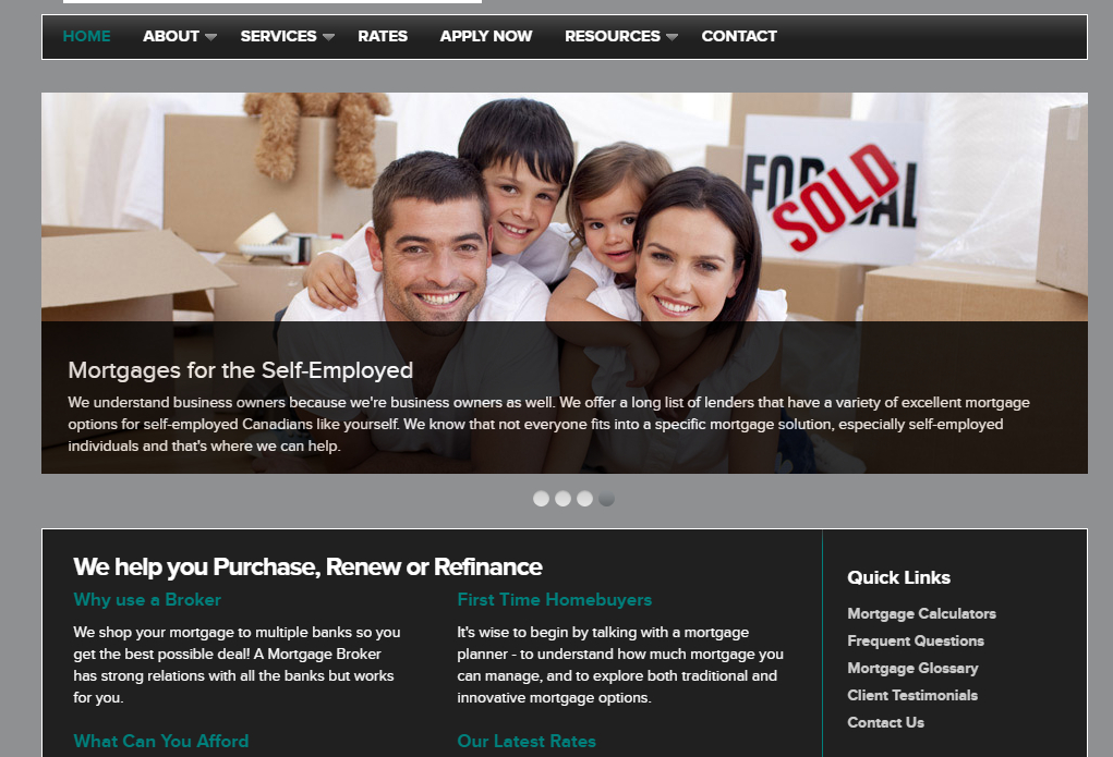
Let’s look at a non-responsive template:
On a desktop or laptop, this looks great!  But on a smaller device, the truth is revealed. This site is non-responsive! The Scroll Bar at the bottom is a big no-no, not to mention banner image is now playing peek-a-boo…
How is a responsive (mobile friendly) site different?
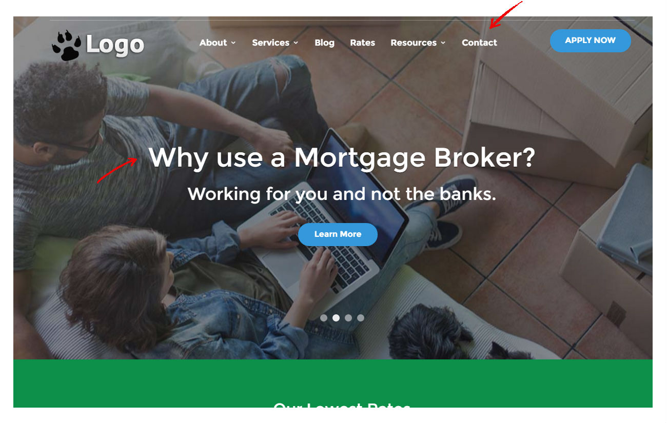
At first glance, it's a similiar experience, but take a look at the menu and banner on a mobile device...
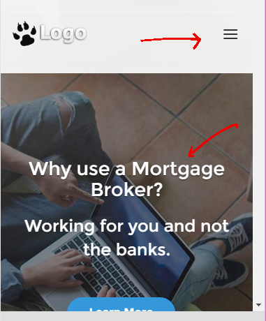 See how the menu reformats itself and tucks away into the compressed three bar menu at the top, and as well the banner rearranges to present well on the mobile device you’re using.
Nothing lost to the sides, and navigation is seamless for your consumer.
What does it mean for Google?
Mobile sites will continue to outrank non-responsive designs thanks to Google’s new algorithm released in 2015. What does that really mean? Mobile sites win the internet, and if you don’t have one already, it’s time to be responsive to the idea.
If you’re curious as to how mobile friendly your site is, try this google tool! https://www.google.ca/webmasters/tools/mobile-friendly
Need more help or have any questions?
Contact Us today if you might be interested in learning more about any services that we offer and how we can help bring your website to the next level.